
The best living room color ideas do more than make a room look attractive. Color can help a living room feel brighter, warmer, calmer, more sophisticated, or more inviting. Because this space is often used for relaxing, entertaining, and spending time with family, the right palette should support both your decorating style and everyday life.
Warm whites remain dependable, but they are no longer the only safe option. Soft blue, sage green, mushroom, creamy yellow, burgundy, and rich blue-gray can all create comfortable living rooms when they are coordinated with the room’s lighting, furniture, floors, and fixed finishes.
This guide explores practical and beautiful living room palettes, along with advice for choosing a shade that works in your actual space.
Quick Guide to Living Room Color Ideas
| Color idea | Mood it creates | Works well with |
| Warm white | Bright and timeless | Wood, linen, black accents |
| Greige | Balanced and versatile | Cream, brass, natural textures |
| Mushroom | Layered and sophisticated | Olive, amber, black, blue-gray |
| Pale blue-gray | Calm and airy | White, oak, woven materials |
| Deep blue-gray | Traditional and dramatic | Pattern, leather, antique wood |
| Sage green | Natural and restful | Cream, tan, wood, stone |
| Burgundy | Rich and intimate | Neutral upholstery, brass, walnut |
| Creamy yellow | Cheerful and classic | White, brown, natural fibers |
| Mauve | Soft and elegant | Warm gray, cream, dark wood |
| Charcoal | Cozy and modern | Pale upholstery, metal, warm wood |
1. Warm White for a Timeless Living Room
Warm white is one of the most adaptable living room color ideas. It reflects light, works with almost every decorating style, and allows furniture, artwork, and architectural features to receive more attention.
Unlike a sharp, blue-toned white, a warm white contains subtle cream, beige, or yellow undertones. These undertones help prevent the room from feeling cold or unfinished.
A warm-white living room works especially well with:
- Natural wood furniture
- Linen upholstery
- Woven baskets
- Black or charcoal details
- Warm metallic finishes
- Colorful artwork
Behr identifies warm whites as flexible backdrops for living spaces. Kaitlin Madden also demonstrates how white walls can feel tailored and timeless when paired with a dark fireplace or other strong architectural accent.
To keep a white living room from looking sterile, use several layers of texture. Add curtains, rugs, cushions, wood, ceramics, plants, and upholstered furniture in slightly different neutral tones.
2. Greige for a Balanced Neutral Scheme
Greige sits between gray and beige. It offers the calm appearance of gray without always feeling as cool, while providing more depth than a basic beige.
This color is useful when the room contains both warm and cool finishes. For example, greige can connect a gray sofa with warm wood flooring or combine black accents with beige upholstery.
Behr suggests shades such as Wheat Bread for a comfortable greige effect. However, every greige has a different undertone. Some appear beige in afternoon light, while others look gray, green, or even slightly violet.
Test a large sample next to:
- Flooring
- Sofa fabric
- Curtains
- Fireplace stone
- Built-in cabinetry
- Adjacent room colors
Greige is a dependable choice for homeowners who want neutral walls with more character than plain white.
3. Mushroom for a Sophisticated Alternative to Beige
Mushroom is one of the most interesting neutral living room color ideas. It is generally deeper and earthier than beige, often combining taupe, gray, brown, or green undertones.
Kaitlin Madden describes mushroom as a richer and more sophisticated relative of beige. In her own family room, she uses Benjamin Moore Finnie Gray, a greige shade with noticeable green undertones.
Mushroom walls can pair beautifully with:
- Cream upholstery
- Black furniture
- Sage or olive accents
- Amber glass
- Blue-gray textiles
- Dark wood
- Aged brass
This color works particularly well in traditional, transitional, rustic, and vintage-inspired living rooms. It creates a warm foundation without requiring a dramatic or highly saturated wall color.
4. Pale Blue-Gray for a Calm, Airy Space
Pale blue-gray can make a living room feel peaceful without appearing childish or overly coastal. The gray undertone reduces the brightness of the blue, producing a softer and more livable result.
This palette works well in rooms with:
- White trim
- Light oak
- Gray upholstery
- Soft cream fabrics
- Silver or nickel finishes
- Natural woven materials
Kaitlin Madden highlights Farrow & Ball Light Blue as an example and recommends similar shades such as Benjamin Moore Wales Gray, Benjamin Moore Imperial Gray, and Sherwin-Williams Silvermist.
Pale blue-gray may appear cooler in a north-facing room and brighter in strong natural sunlight. Always test it during the morning, afternoon, and evening before painting the entire room.
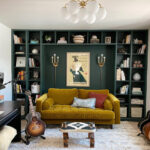
5. Rich Blue-Gray for Traditional Depth
A deeper blue-gray creates a more established, collected, and dramatic atmosphere. It is especially effective in traditional living rooms containing patterned fabrics, antique furniture, books, artwork, and decorative molding.
Farrow & Ball Oval Room Blue is one example of this type of color. Similar alternatives mentioned by Kaitlin Madden include Benjamin Moore Providence Blue and Benjamin Moore Blue Spruce.
Deep blue-gray walls work well with:
- Brown leather
- Dark wood furniture
- Cream curtains
- Red or rust accents
- Brass lighting
- Floral or striped textiles
This is a strong option for a formal living room, library-style lounge, or room that receives plenty of natural light.
6. Sage Green for a Relaxed, Nature-Inspired Room
Sage green remains popular because it brings color into a living room while still behaving like a neutral. Its gray undertones make it easier to coordinate with wood, cream, tan, stone, and woven textures.
Behr recommends soft greens for creating a calm, nature-inspired atmosphere. Kaitlin Madden presents Farrow & Ball French Gray as an example of a green-gray shade that can be used across the walls and trim.
Sage green works especially well with:
- Oak or walnut furniture
- Off-white upholstery
- Terracotta accessories
- Beige curtains
- Natural stone
- Black accents
- Indoor plants
For a gentle look, keep the trim white or cream. For a more immersive result, paint the walls, trim, and architectural details in the same sage shade.
7. Burgundy for a Rich and Intimate Living Room
Burgundy creates warmth, depth, and visual drama. It can make a large living room feel more intimate or give a smaller lounge a cozy, jewel-box quality.
This color looks particularly effective with:
- White or cream sofas
- Walnut furniture
- Brass lighting
- Neutral rugs
- Dark wood flooring
- Antique artwork
Kaitlin Madden recommends extending burgundy onto the trim rather than automatically pairing it with bright white. This color-drenched approach creates a more cohesive and contemporary appearance.
Burgundy is a bold choice, so consider the room’s lighting carefully. In a dark room, it may appear almost brown or black. In warm sunlight, its red and purple undertones can become more visible.
8. Creamy Yellow for Warmth and Character
Creamy yellow offers a cheerful alternative to beige or white. The key is to choose a muted shade with enough neutral undertones to prevent it from becoming overly bright.
A rich, creamy yellow can work beautifully in a country, traditional, cottage, or vintage-inspired living room. It pairs naturally with:
- Cream furniture
- Dark wood
- Blue accents
- Botanical patterns
- Natural fibers
- White trim
This color is especially useful in rooms that need warmth. However, a strong yellow can intensify under artificial lighting, so sampling is essential.
9. Mauve for Soft Elegance
Mauve combines pink, purple, gray, and brown undertones. It can feel elegant and grown-up when it is muted rather than sugary or highly saturated.
A mauve living room can be paired with:
- Cream
- Mushroom
- Warm gray
- Dark brown
- Aged brass
- Dusty blue
- Soft green
Mauve is more distinctive than greige or white, so it may not suit every home. However, it can create a memorable and refined space when coordinated with traditional furnishings and natural materials.
10. Terracotta for an Earthy Living Room
Terracotta brings warmth, personality, and an earthy quality to a living room. It sits comfortably between orange, red, brown, and clay tones.
Behr recommends warmer colors such as terracotta for adding character. This palette can be particularly attractive in Mediterranean, bohemian, Southwestern, rustic, or eclectic homes.
Pair terracotta with:
- Warm white
- Olive green
- Natural wood
- Woven materials
- Cream upholstery
- Black accents
- Aged metals
For a softer result, choose a dusty clay shade. For greater drama, use a deeper burnt-orange or reddish-brown tone.
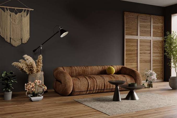
11. Charcoal for a Cozy, Modern Look
Charcoal can make a living room feel grounded, polished, and intimate. Although dark colors are sometimes avoided in small rooms, they can blur visual boundaries and create a cocooning effect.
Charcoal works well with:
- Pale sofas
- Warm wood
- Brass
- Cream curtains
- Colorful artwork
- Textured rugs
- White ceilings
Behr includes Graphic Charcoal among its featured living-room colors. A dark shade can also be limited to a fireplace, built-in bookcase, media wall, or architectural feature when painting every wall feels too dramatic.
12. Soft Green-Blue for a Fresh, Casual Space
A gentle blue-green combines the restful qualities of both colors. Behr presents Breezeway as an example of a soft blue-green that coordinates well with wood, woven materials, and relaxed furniture.
This color can suit:
- Coastal living rooms
- Casual family rooms
- Cottage interiors
- Transitional spaces
- Nature-inspired schemes
Use cream, light wood, sand, and natural textiles to keep the room soft. Black or deep navy accents can provide definition.
13. White Walls With Neutral Contrast Trim
Contrast trim offers a way to add interest without painting the entire living room a strong color. One subtle approach is to combine white walls with soft taupe, mushroom, or greige trim.
This treatment can highlight:
- Door frames
- Windows
- Crown molding
- Baseboards
- Built-in shelves
- Wall paneling
Kaitlin Madden connects this look with historic and colonial interiors. It works well when you want architectural detail without the intensity of a bold wall color.
The contrast should be visible but not harsh. A warm white paired with a medium greige usually feels softer than bright white beside a cool gray.
14. White Walls With Dark Contrast Trim
For a bolder version of contrast trim, pair neutral walls with:
- Navy
- Charcoal
- Off-black
- Deep brown
- Dark green
Dark trim can give a living room a stronger architectural identity. It is particularly effective in rooms that also function as a library, game room, lounge, or media room.
Repeat the trim color in small details such as picture frames, lamps, furniture legs, or curtain rods so it feels connected to the overall design.
15. Color Drenching for a Cohesive Effect
Color drenching involves painting multiple surfaces in the same or closely related shade. Walls, trim, doors, built-ins, and sometimes ceilings are treated as part of one continuous color scheme.
This approach can:
- Make awkward architectural details less noticeable
- Create a more immersive room
- Give traditional molding a contemporary look
- Make strong colors feel intentional
- Reduce visual interruption
Sage, burgundy, blue-gray, mushroom, and muted neutrals are all suitable for color drenching.
You can vary the paint finish while keeping the color consistent. For example, use eggshell on the walls and a more durable satin or semi-gloss finish on trim and doors.
How to Choose the Right Living Room Color
Beautiful living room color ideas will not look identical in every home. Before making a final choice, consider the following factors.
Start With the Room’s Fixed Elements
Look at the items that are expensive or difficult to replace:
- Flooring
- Fireplace materials
- Built-in cabinets
- Large furniture
- Stone or brick
- Window treatments
Your wall color should coordinate with these elements rather than compete with them.
Identify the Undertones
A color may contain warm, cool, green, pink, violet, or yellow undertones. Compare paint samples directly with your furniture and finishes to see whether the undertones work together.
For example, a cool gray may appear disconnected beside honey-colored floors, while a warm greige may create a smoother transition.
Consider Natural and Artificial Light
HGTV and Behr both emphasize the importance of lighting. A color can change noticeably throughout the day.
- North-facing rooms often make colors look cooler.
- South-facing rooms generally receive warmer, stronger light.
- Warm bulbs may increase yellow or red undertones.
- Cool bulbs may emphasize gray, green, or blue.
View samples in the morning, afternoon, and evening.
Test Large Samples
Do not rely only on a small paint chip or a digital image. Paint a large sample board or apply the color to more than one wall.
Move sample boards around the room and place them beside the sofa, floor, fireplace, and curtains. This helps reveal how the color reacts to different light and surroundings.
Coordinate Connected Rooms
In an open floor plan, rooms do not need to match exactly. HGTV recommends creating flow through a repeated trim color, related undertones, or a shared color family.
For example, a warm-white living room can connect naturally to a greige dining space and a kitchen with a deep green island.
What Is the Best Paint Finish for Living Room Walls?
Eggshell is a practical choice for many living rooms. It offers a subtle sheen and is generally easier to clean than flat paint.
Matte paint can create a softer and more understated result, but it may show marks more easily depending on the product. Homes with children, pets, or frequent activity may benefit from a washable, scuff-resistant formula.
Use a more durable finish, such as satin or semi-gloss, for:
- Trim
- Doors
- Built-in shelves
- Frequently touched architectural details
Always check the paint manufacturer’s instructions because sheen levels and performance vary between product lines.
Frequently Asked Questions
Popular choices include warm white, greige, mushroom, sage green, blue-gray, soft blue-green, burgundy, terracotta, and charcoal. Current palettes generally favor warm, livable neutrals and muted nature-inspired colors.
Warm white, cream, pale blue-gray, soft greige, and light green can help a room feel more open. However, lighting, furniture scale, contrast, and clutter also influence how spacious the room appears.
Either option can work. A lighter living room may feel open and inviting, while a darker living room can create a cozy destination. Use related undertones or consistent trim to connect the spaces.
Warm white, sage, muted blue, mushroom, taupe, beige-gray, and soft green often coordinate well with wood floors. The best choice depends on whether the wood has golden, red, gray, or dark brown undertones.
Gray can still work, especially when it has warm, blue, green, or beige undertones. Pure cool gray may feel flat in some rooms, while greige, blue-gray, and mushroom generally create more depth.
No. Trim can be painted greige, taupe, navy, charcoal, deep brown, green, or the same color as the walls. Contrast trim and color drenching can make architectural details more noticeable or create a more cohesive effect.
Soft green, pale blue-gray, warm white, mushroom, and muted blue-green are often associated with calm interiors. Personal preference and lighting remain important, so test the color in the room before deciding.
Final Thoughts
The most successful living room color ideas begin with the room itself. Consider the natural light, fixed finishes, furniture, flooring, and atmosphere you want to create before selecting a shade.
Warm white and greige provide flexible foundations, while mushroom, sage, and blue-gray introduce subtle personality. Burgundy, terracotta, charcoal, and deep blue can create richer and more intimate spaces. Contrast trim and color drenching offer additional ways to use paint beyond the main walls.
Whatever palette you choose, test large samples in the actual living room. A color that looks perfect online may appear completely different beside your sofa, flooring, curtains, and evening lighting. Careful sampling is the most reliable way to turn an attractive color idea into a living room that feels comfortable, balanced, and personal.